Colors
Our color system reflects the natural environment of campus, the enduring values of our institution, and Loyola Maryland's rich athletic traditions.
Greens anchor the palette, symbolizing growth, access, renewal, and continuity —core to the Loyola experience.
Supporting colors expand flexibility while maintaining cohesion, allowing the brand to adapt across different contexts without losing its identity.
Brand Colors

#003D34
C 97 M 57 Y 73 K 54
Pantone 7729

#D2D2D2
C 0 M 0 Y 0 K 18
Pantone 427

#009164
C 96 M 14 Y 82 K 2
Pantone 3405

#C1EEDF
C 24 M 2 Y 16 K 0
Pantone 331
Color Guidance
- Always follow provided HEX, CMYK, and Pantone values.
- Test colors across mediums when accuracy is critical.
- Avoid approximations—precision reinforces professionalism.
- Lead with Loyola Green to maintain strong brand recognition.
- Use secondary and tertiary colors to create hierarchy and emphasis—not decoration.
- Avoid overly saturated or high-contrast combinations that break the system’s calm confidence.
Consistent color reproduction is essential to maintaining brand integrity across print and digital environments. These specifications ensure that Loyola Green—and the broader palette—appear as intended in every context.
Color Accessibility
Color is one of the most immediate ways people experience the Loyola brand—but it must work for everyone.
Accessible color use ensures that our communications are clear, readable, and inclusive across a wide range of environments and audiences.
Beyond adhering to technical requirements, this is an extension of our values. A brand built on connection and purpose should never create barriers to understanding. When color contrast and clarity are prioritized, we ensure every message can be seen, understood, and acted on.
The color combinations shown here are designed to meet applicable WCAG AA contrast standards and should be used as approved pairings whenever possible. Consistency also plays a critical role—when our colors appear as intended across print, digital, and environmental applications, we reinforce trust, professionalism, and recognition.
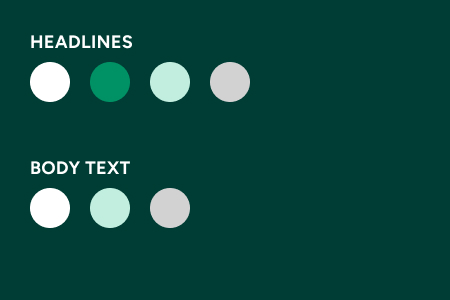
Headline text is defined as 18px and bold or larger, with Body text as 14px or larger.
Accessibility Guidance
- Use approved color combinations and text sizes that meet WCAG AA contrast standards.
- Ensure sufficient contrast between text and background colors for readability.
- Never rely on color alone to communicate meaning.
- Test color combinations across devices and lighting conditions.
- Follow approved color values to maintain consistency and clarity.
Loyola Green
Headlines
- Hounds Grey
- Sprout
- Dewdrop
- White
- Hounds Grey
- Dewdrop
- White
Hounds Grey
Headlines and Body
- Loyola Green

Sprout
Headlines
- Loyola Green
- Dewdrop
- White
- Loyola Green

Dewdrop
Headlines
- Loyola Green
- Sprout
- Loyola Green