Typography
Our typography balances tradition and clarity. Serif typefaces convey academic rigor and history, while sans-serif elements introduce accessibility and modernity.
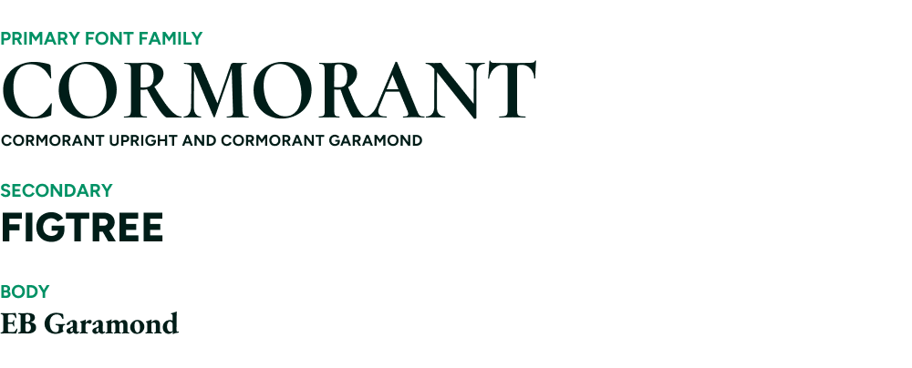
Together, they mirror the Loyola experience: grounded in legacy, but oriented toward what’s next.
Guidance
- Use serif fonts (Cormorant, EB Garamond) for storytelling, long-form content, and academic tone.
- Use sans-serif (Figtree) for clarity, hierarchy, and digital applications.
- Maintain consistency—type is one of the fastest ways to either build or break brand cohesion.
Typography Usage Guide for Print and Web
Typography should create a clear and consistent hierarchy across all communications. Each typeface plays a distinct role, working together to guide the reader and reinforce tone. Circumstances will dictate exact sizes and how many styles are required within each piece based on scope and scale, but less-is- more should always be taken into consideration.
The system is designed to balance elegance with clarity—never one at the expense of the other.
Display Text
Display text is your largest, boldest copy on any asset and should be used to communicate a single, primary idea. Limit each asset, spread, or piece to one display message and one display style to maintain clarity and impact. This restraint ensures the message remains focused and immediately understood—creating a strong visual entry point that draws attention without competing elements.

Headlines
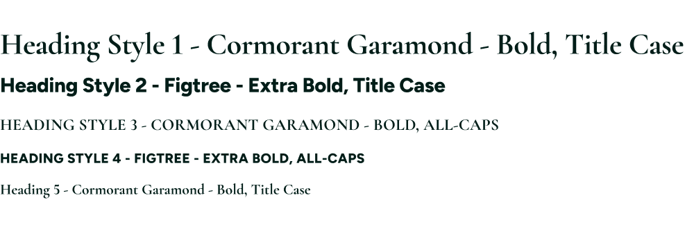
As content becomes more detailed, apply heading styles progressively (H1–H5) to create a clear hierarchy. Higher-level headings should introduce primary ideas, while subsequent levels organize supporting information—guiding the reader naturally from broad concepts to finer detail without competing for attention. This structured approach improves readability, reinforces consistency across materials, and helps audiences quickly understand and navigate content— especially in digital environments where clarity and speed matter most.
Download Fonts