Logo and Visual Identity
Our visual identity, including our logo, wordmark, shield, monogram, and academic seal, is designed to express movement—from curiosity to clarity, from potential to purpose.
Use the identity system consistently to reinforce recognition, but more importantly, to reinforce meaning. Every application should feel intentional, confident, and rooted in the idea that transformation happens here.
Our Logo
The Loyola University Maryland logo is the clearest expression of our identity. It represents the institution as a whole and should be treated with consistency and respect across all applications.
Visually, the logo reflects a balance of tradition and clarity—echoing our academic rigor and values-based foundation. Conceptually, it anchors the idea that while each student’s journey is unique, it begins from a shared place of purpose.
Guidance
- Use the primary logo in most external-facing communications.
- Our logo should only be used in a single color: Loyola Green.
- Maintain clear space to preserve its integrity.
- Avoid modifying or reinterpreting the mark.
- Pair with the brand campaign tagline lockup when a clear brand statement is needed.
Primary Mark
Our primary mark—provided in two layouts—is the most visible expressions of the Loyola identity. They are designed for clarity, recognition, and consistency across a wide range of applications.
These marks carry the full weight of the brand—representing the institution and experience equally; what it means to go here and what it means to find your "more" here. As such, they should feel confident, balanced, and unmistakably Loyola.
Guidance
- Use for all high-visibility, external communications.
- Prioritize legibility at all sizes.
- Avoid embellishment or competing visual elements that dilute impact.
Logo Color
All logos and lock-ups within the Loyola University Maryland architecture must be used in our approved brand colors: Loyola Green or white. No other logo colors are acceptable and logo files may not be altered to change the color.
The Loyola Green logo may be used on Sprout but the white logo offers the greatest contrast ratio.
Guidance for Dark Backgrounds
Optimized White Version
The optimized white version of the primary mark is designed specifically for use on dark backgrounds. Adjustments have been made to preserve clarity, balance, and legibility when the mark is reversed. Because of these refinements, this version should always be used instead of manually reversing the standard logo.
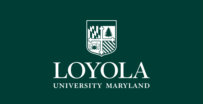
Do not simply invert the logo
The primary mark should never be reversed from its positive (full-color or dark) version for use on dark backgrounds. Simply inverting the logo compromises legibility, disrupts visual balance, and alters key brand details—most notably the Evergreen, which must always remain Loyola Green. Using the optimized white version ensures the mark remains clear, consistent, and true to the Loyola identity.
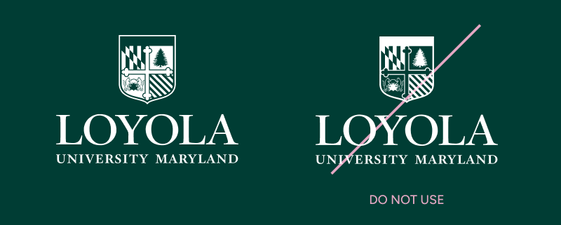

Note: the Evergreen tree is always the background color. It is never white.
Size and Scale
The Loyola wordmark must remain clear, legible, and balanced at every size. Maintaining an appropriate minimum size ensures the integrity of the mark—preserving detail, readability, and overall presence across applications. As the mark scales down, fine details—particularly within the shield—can become difficult to reproduce. Establishing a minimum size prevents degradation and ensures the brand is always presented with clarity and confidence.
Minimum size
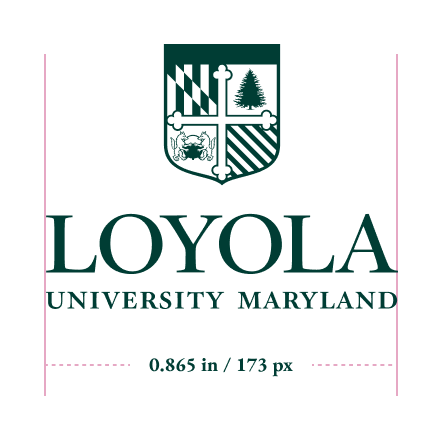
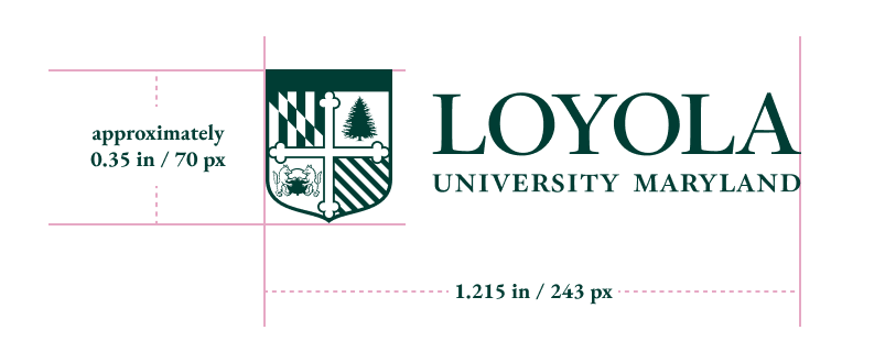
The stacked logo must not appear smaller than 0.865 inches (173 pixels) wide in standard applications. The horizontal logo must not appear smaller than 1.215 inches (243 pixels) wide. In all cases, the shield must never scale below 0.35 inches (70 pixels) in height. Any reduction beyond these limits compromises legibility and is not permitted.
Guidance
- Never scale the logo below the approved minimum sizes.
- Prioritize clarity—if the mark feels crowded or unclear, increase its size.
- Use simplified or alternate marks (such as the monogram or wordmark) in extremely small applications.
- Test across formats—what works in print may not translate at small digital sizes.
Logo File Downloads
For Print
File format: EPS
Color space: CMYK
- Centered green logo (print)
- Centered white logo (print)
- Centered black logo (print)
- Horizontal green logo (print)
- Horizontal white logo (print)
- Horizontal black logo (print)
For Digital
File format: PNG
Color space: RGB
- Centered green logo (digital)
- Centered white logo (digital)
- Centered black logo (digital)
- Horizontal green logo (digital)
- Horizontal white logo (digital)
- Horizontal black logo (digital)


School Logos
Individual school logo configurations extend the Loyola identity across the University’s academic offerings with greater clarity and consistency. By pairing the institutional mark with a school name in a standardized lockup, these configurations create a clear connection to the Loyola brand while allowing each school to be represented in a way that feels distinct. To preserve visual integrity and ensure consistency across the system, only approved logo configurations should be used. School names should never be typeset into the mark or arranged into custom lockups.
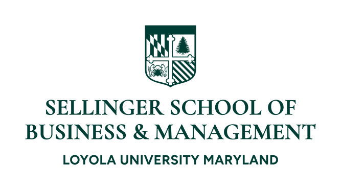
Please contact office of marketing and communications for guidance and support with school logos.
Wordmark
The wordmark is a streamlined expression of the Loyola name, designed for clarity, readability, and everyday use. It performs best in environments where simplicity and flexibility are essential—particularly across digital, promotional, and high-frequency touchpoints.
While more minimal than the primary mark, it maintains the same sense of confidence and institutional presence.

Guidance
- Always maintain the minimum clear space around the wordmark and shield.
- Do not place text, imagery, or graphic elements within this area.
Increase clear space when possible—more room creates greater presence. - Apply consistently across all formats, from digital to environmental applications.
Wordmark File Downloads
For Print
File format: EPS
Color space: CMYK
For Digital
File format: PNG
Color space: RGB



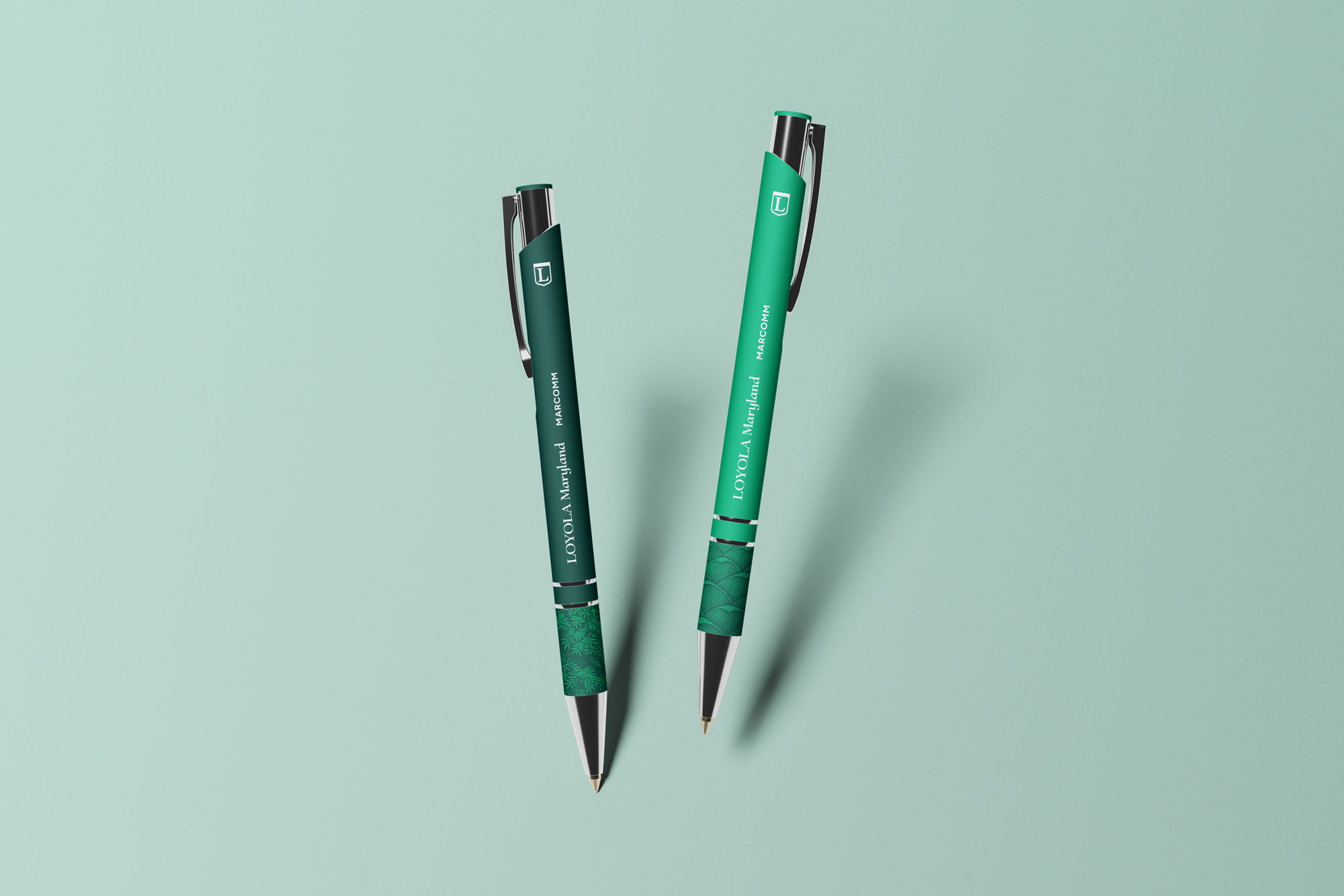
Sample Use of Extended Wordmark
The extended wordmark is reserved for situations with production limitations—small-scale applications or embroidery, for example. In these instances, the monogram may be used elsewhere as a secondary brand element, but should never be locked up alongside the extended wordmark. The shield should never be paired with the extended wordmark.

Shield
Within the broader identity, the shield serves as a secondary element—concise, recognizable, and rooted in Loyola’s heritage. It offers a more compact expression of the brand, but it is not a replacement for the full logo.

The shield should not be used as the sole identifier in most communications. When used, it must be paired with the primary mark or wordmark elsewhere in the composition to ensure clarity and proper attribution.
To maintain legibility, the shield must never appear smaller than 0.35 inches (70 pixels) in height. Below this size, detail is lost and the mark’s integrity is compromised.
Guidance
- Use the shield to convey a sense of prestige, tradition, and institutional authority.
- It may be used in both official and student-facing materials—especially where the goal is to reinforce pride and recognition.
- The shield offers greater flexibility than the primary mark, making it well suited for expressive, student- centered, and high-energy applications while still retaining its institutional character.
- Give the shield space and prominence—it should feel intentional, not decorative.
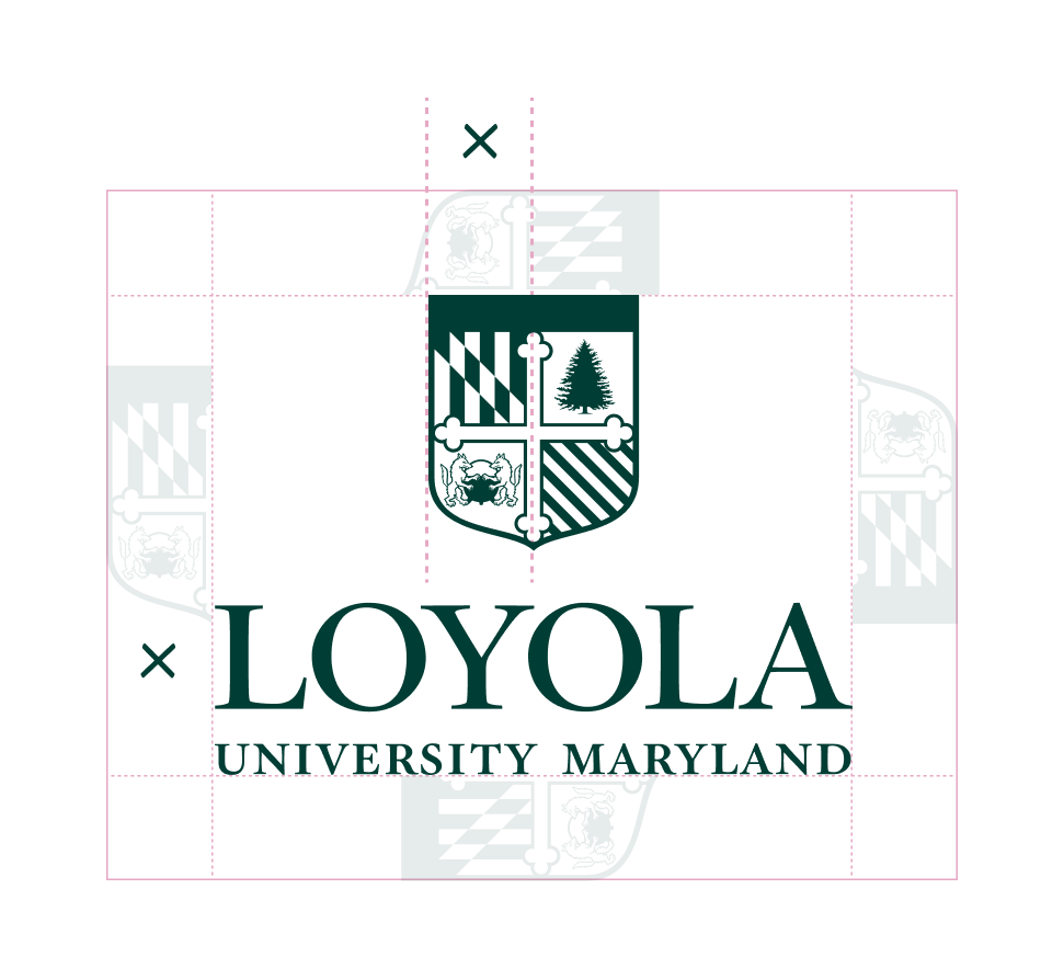
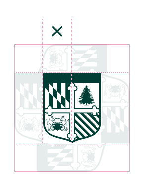
Safe Space
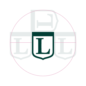
Clear space around the primary mark and shield is essential to maintaining their clarity, presence, and impact. This space ensures the marks are never crowded, competing, or visually diminished by surrounding elements.
More than a technical rule, safe space reinforces how the brand shows up: confident, composed, and assured. By giving the mark room to breathe, we allow it to stand on its own—uninterrupted and immediately recognizable. The defined safe area is based on proportions within the mark itself, creating a consistent buffer regardless of size or application.
Monogram
The monogram distills the Loyola identity into its most compact form. It is best used in moments where the audience already has familiarity with the brand.

Guidance
- Use for internal communications, merchandise, and social avatars.
- Avoid using as a primary identifier in first- touch communications.
- Works best when supporting other brand elements such as the wordmark, or as a sign-off where other visuals do the heavy lifting.
Note on Use of the Monogram
The monogram should not be used as a replacement for the primary mark. In all applications, the primary mark or wordmark should be present and visually more prominent than the monogram. This is to ensure appropriate representation of the Loyola name and brand.
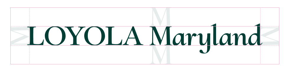
Safe Space
Clear space around the Loyola wordmark and monogram is essential to maintaining their clarity, presence, and impact. This space ensures the marks are never crowded, competing, or visually diminished by surrounding elements.
More than a technical rule, safe space reinforces how the brand shows up: confident, composed, and assured. By giving the mark room to breathe, we allow it to stand on its own—uninterrupted and immediately recognizable. The defined safe area is based on proportions within the mark itself, creating a consistent buffer regardless of size or application.
Guidance
- Always maintain the minimum clear space around the wordmark and monogram.
- Do not place text, imagery, or graphic elements within this area.
- Increase clear space when possible—more room creates greater presence.
- Apply consistently across all formats, from digital to environmental applications.
Monogram File Downloads
For Print
File format: EPS
Color space: CMYK
For Digital
File format: PNG
Color space: RGB



Ceremonial Mark
The ceremonial mark represents the most formal expression of the Loyola identity. It is reserved for moments of tradition, recognition, and institutional significance.
This mark reflects the depth of Loyola’s history and the enduring values that guide its future.
-
Use for formal events, ceremonial materials, and official documents such as certificates, awards, and acceptance letters.
- Avoid use in marketing or casual communications.
- Treat with restraint—its power comes from rarity.
Academic Seal
The academic seal represents our school at its most formal and prestigious. Reserved for the highest-stakes institutional expressions, it signals academic excellence and the full weight of Loyola University Maryland.
Guidance
- Use exclusively on diplomas, transcripts, presidential correspondence, certificates, awards, and acceptance letters.
- Like the ceremonial mark, its significance depends on restraint.
- Contact the Office of Marketing and Communications for requests.
Legacy Graphics and Custom Marks
Loyola's visual identity is an important expression of its institutional reputation and helps create a consistent, recognizable brand across all audiences and experiences. As the brand evolves, existing marketing graphics, logos, and other visual assets may remain in circulation that were developed under previous brand standards. These assets may continue to have value and recognition within specific groups; however, their continued use does not mean that they represent the current visual identity.
As materials are refreshed, campaigns are renewed, or new content is developed, teams should transition toward the current Loyola brand. This approach allows for the university to improve brand consistency over time.
There are circumstances in which a campaign, event, or initiative may benefit from a distinct visual identity. A custom mark may be appropriate when an initiative has a significant strategic objective, broad visibility and reach, and meaningful institutional impact. Custom marks will be created selectively and should reinforce Loyola's identity.
The Loyola brand should remain the primary identifier for the university and its areas. Teams should use the available tools from the current brand guidelines. Typography, color, graphic elements, photography, and messaging can all be used in unique ways to promote and distinguish an event or initiative.